Wednesday, 13 May 2015

More Design Experiments

As i still felt that the designs were not right for the brief, i continued to experiment with different designs. 

I felt that my current designs were still missing that extra something that was wanted from the brief to make the Honey Beez product look more high end to increase sales.

I decided to completely change the way i was currently designing. This was to try and make that extra step up to make the product look like a premium brand.

These were the next set of designs i put forward. 


Firstly i decided to create an image that represents honeycomb, however i believe that this design still keeps the high end look that the company was looking for in the brief. As i felt that this bit of design would work well on the jar of honey, especially when colour has been added, which you can see below. 


After i we had come to the conclusion that this design was the one we wanted to take, i started to add colour to the shapes, as well as adding a few more shapes to keep the effect going up the page. I liked this design, however i felt that the top of the page as well as the jar looked a little sparse of detail, therefore i continued with the development of the design. Which you can see below.


This is when i came up with this design. As you can see i have implemented the honeycomb effect on the top of the page to fix the issue of it looking a little bare in the previous image, However after consulting we decided to keep the extra shapes in the middle of the page, as we thought that this give the design a little bit extra, rather than the middle being bare.
I also added the fair trade logo to the design, as the company made it clear in the brief that this was an important aspect of the honey that the wanted the customers to know about, as they thought that this would give the customers a feel good feeling when buying it.  

Continued Design Tests

Therefore i decided to change my designs giving me a better understanding of were i wanted my design to go, as well as the company, which is to give the company a more high end premium looking honey to increase the sales of the product. 

This then took me to the designs to what you can see below.


These were the designs i came up with next. I wanted to use the honeycomb effect on the bottom half of the jars. However i still felt that these designs were missing something. The top image i felt that the honeycomb effect didn't give off the realistic effect that i wanted it to, also i felt that this would not be a sufficient design for the Honey Beez to increase the sales of there honey. 
This was also the case for the bottom image, as i still felt that the design was missing something, for it to fully stand out on the shelf of the supermarkets. 

Because of this i continued to experiment wit different types of designs that would better represent the information that's presented in the brief.

Initial Design Tests

The first thing that i decided to look at in terms of design, was beehives. Therefore i designed different types of beehives that all had different effects on them to see if these would work on the Honey Beez honey. 

These can been seen below.
As you can see from the image above, you can see that i have added different effects on all the different beehives. However i still thought that i needed to see this in a more complete way. 
Therefore you can see that i have continued this test by adding honey dripping from above the beehive, as well as coming through the bottom of the beehive. 


However after this i still thought that this design was not what i was expecting, in terms of end result, not only for me, but also Honey Beez, and the requirements that was expected from the brief. As a result i decided to continue my designs in a different direction, but still kept this design in case i wanted to go back to this later if i thought of a better way to implement it to the Honey Beez honey.

Continued Research Into Existing Honey Labelling

After this i still thought it would be best to continue my research into existing honey products on the market today. However this time i tried to focus on more high end looking honey products, as this is what Honey Beez is looking for. 

Which you can see from the images below.


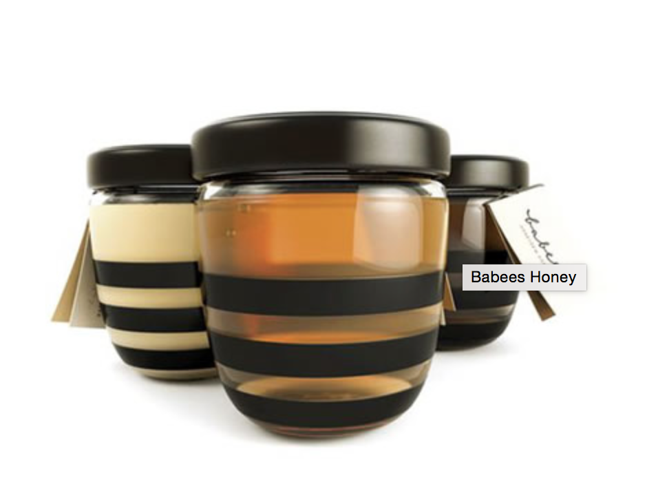
I especially like the way this product has use the lid as a part of the design, attaching the honey dipper to it, which is again in the shape of a beehive. As well as this they have also continued this in the design of the jar as they have continued the stripe effect around the centre of the jar.  


With the image above, it again shows the more high end product, As they have used a honeycomb type effect on the jar in black. However with the clear jar, were you can see the honey through it, it gives the product as a whole a very high end look to it. This coupled with the black label ties the whole product together really nicely, giving the product a premium look to it. 


The image above again shows a more a high end honey product. This design shows a more simplistic design, with a simple but effective honey drip coming from the top of the lid that runs down 3/4 of the jar. This runs from the black label on the lid, to the black label in the centre of the front of the jar, giving the design a consistent look to it. In addition to this i also like the jar itself, as i feel that the look of it gives the product as a whole a more expensive look to it.
This packaging shows a different way to advertise the honey product. As you can see, the beehive shape dismantles, as each ring separates, to eventually show the jar of honey inside. This is a totally different way of advertising, and this is why i think that's product would sell well. Because this is a totally different way of thinking, i believe that this would make people more aware of this, and be more willing to pick this up of the shelf because of the quirky aspect that it has. 


I really like the way the design of this honey product has been thought about to how this product would look on the shelf in the supermarkets. As the way the product is shaped gives off the honeycomb effect that we have seen previous. Not only that, the overall design has also been completed to a very high standard, again giving this product an extra edge with a premium look.  


I like the product above shows another different way to design honey. The design of this product is very simply, however it is the packaging of this product that makes it. As i have said in the previous designs above, it has a quirky look to it. In addition to the packaging being wood, it also gives the honey a more fair trade and organic feel to it. 


For this honey product the thing that stood out to me the most was the colour scheme of the whole packaging. As the window were you can see the honey through, really complements the colour of the cutout that has been used as well as this colour of the actual box that the honey is in. As the black, yellow and orange really works well together, giving the honey packaging a premium high end look and feel to it. 


Initial Research Into Existing Honey Packaging

After reading through the brief, and noting the key points from it, i decided to research existing honey products, and there labelling. From this i noticed that a lot of the current labels currently on the market today, show some sort of beehive, or honeycomb print. Obviously these are clear references to the bees, as well as the end product.


From the images above you can see that the majority if not all of my initial research shows some sort of reference to beehives or honeycomb. I especially liked the way the image directly above incorporates the use of the honey dipper into its logo. Giving this labelling an extra bit of quirkiness to it. 

Therefore i tried looking at taking a bit of design from all of the images above, as i believe that all of the design above give off a very professional look and feel to them. Which is something that the Honey Beez honey is currently missing.  


Re - Written Brief

Project Brief

Project Title : Honey Rebrand Campaign


Objective: To give ‘Honey Bee-z’ a more sophisticated look.

  1. To rebrand a totally new look and advertising campaign for the ‘Honey Bee-z’ product.
  2. To change the look of the product, which will result in the increase of sales, as well as the recognition of the honey.
  3. To create new and current advertising and promotional materials for the company that will give the product an improved look.

Strategy:
Being based in Santiago, Chile, our family has been at the forefront of producing only the best honey that is available in the region. The cool southern rainforest regions, as well as the sunny and warm central valley, helps Chile deliver a wide range of honey types that are rich in flavour and activity. We believe that the bees should get all the buzz, as we did the easy part, so Primo are proud to offer the ‘Honey Bee-z” brand, active 12, which is now available at all Home Bargains stores in England. Im looking to create an all new design for the ‘Honey Bee-z’ product, that will result in the expansion in the industry, in addition to this, be able to have that eye catching appeal to stand out from other competitors in the market. Honey Bee-z currently has the advantage over its competitors with features of Manuka honey. We will look to find these key features, and promote them in the best possible way, to show the differences in “total activity honey” and “Manuka honey activity”. Once this is recognised by consumers, the sales of honey will increase. 

Target:
The target that we are looking at aiming at are shops that sell and also provide the highest quality products, as well as also selling a substantial amount of fair trade products. In addition to this we will look at the type of customers that buy honey, were they buy their other foods, as well as whether they are shopping online, getting it delivered, or going to the shops themselves.

Current Perceptions:
The current feedback of the Honey Bee-z product is that the turnover in sales isn't at the level they expect. They believe this to be down to the fact the labelling, design and pricing of the product, isn't at the level they want it to be compared to there competitors. Also were the product is being paced on the shelves compared to the competitors. 

Desired Perceptions:
A mature and classy look is wanted for the final product, which has all the key information about what the honey provides. 

Insight:
Customers don't realise that they are missing out on a premium product, instead choosing a low end product, due to the current labelling and design, as well as the pricing. This opportunity will catch the attention of buyers and show off the best features in a new classy design and in turn increase the sales. 

Proposition: (The Reward)
Customers that buy are getting the premium Manuka honey features for the low cost prices. Currently Manuka honey retails at around £24.99, however the Honey Beez product provides very similar features to Manuka honey and retails for around £3.99. Furthermore this honey is fair trade, which will give the customers that buy this product a satisfied and feel good felling. 


The Word:
Beneficial, Rewarding.

What Makes This Unique:
The thing that makes this product unique is the value you get for your money is simply brilliant. As you are getting a product similar to Manuka honey for the price of normal honey. 

Support:
Why wouldn't you buy this high quality honey for the low price?

  • Honey Beez honey is quite simply a better quality product of honey, this is because anything below the price of this honey will contain Chinese honey, which is not good to put inside you.
  • Is an active honey with very similar properties of Manuka.
  • It has the U.M.F (unique manuka factor) that people pay up to £24 for, and this is a very similar product to ours.
  • Our honey is organic as well as coming from a protective biosphere.
  • Has a fair trade status as the producers are getting paid more that anyone else is paying, securing the supply for the future.  


Tone & Manner:
Classy, modern and high end.

Guidelines:
Make sure research has been carried out on the food, in addition to health and safety rules for the labelling and branding to make sure that the information that is essential to be on it so that it is able to be sold. 

Are there media or budget considerations:
No set budgets or media considerations have been set, however you will need to keep in mind the profit margins for the product, and how these changes will effect the product. 

Objective: What is this work expected to achieve?
  1. An increase in the sales of the product, thanks to the making the product more appealing to the customers.
  2. Making the product look more high end, and expensive, this is because this product is premium, that will be sold at a higher price than other honeys. 

Target: Sector, needs, age, position, job, geography etc.
The Honey Beez product is a high end premium honey, therefore the target audience should be:
  • Customers who shop at more expensive supermarkets.
  • Customers that shop online.
  • Working - middle class people

Current Perception: How is the product being perceived?
Honey Beez honey is some of the best quality honey at a very respectable price on the market. However customers are choosing lesser quality, and cheaper jars of honey because of the poor labelling, in addition to the cheap looking jars. 

Desired Perception: How should the product be perceived?
This product should be getting seen as the finest quality honey that you can buy for this price, this is because of the sharing properties with manuka honey, however this is priced at £20 a jar. Whereas Honey Beez is retailed at £4 a jar. 

Insight: Why are people not buying the product?
The same as a lot of things, if the product doesn't look nice, people wont buy it, which is the same with this product. The problem is not the quality of the honey, but the way it looks. Undoubtedly if the product looks cheap it will steer the customers away. 
Guidelines: Are there any legal, practical or product - related inclusions I should consider?

Due to the food industries laws and regulations i will need to incorporate the nutritional values and also the ingredients that the honey contains, this will be on the label l as well as incorporated into the design. 

Initial Enquires

From the beginning of my graphic design degree, I have had a strong indication that I wanted to focus my skills on the advertising and branding side of graphic design. Therefore I wanted to focus carrying out my work placement in a studio that focuses on re-brands and also advertising, or gaining work experience with clients that have put forward a brief for a product to re-brand. By working in a studio or gaining freelance work of re-branding products, I would gain the valuable experience of how things would be run on a day to day basis during projects, like the timeline of when and how fast tasks needed to be completed. Additionally I would also gain experience doing freelance work, as this would show me in a real life situation, the many tasks that I would have to deal with during the project. For example dealing with a client that had a different opinion to mine in the case of the design of the product they have put forward, and how I would deal with that. As well as this it would also show me the amount of work that needs to be done to the highest quality in the short space of time that the clients have set, which would be very similar to a design studio.